Next Upcoming Google+ Hangout: Tuesday, August 27 @ 7PM (CST) - To Participate CLICK HERE

Help Me, Help You...
This form does not yet contain any fields.

    Stats Make Me Cry is a place to share ideas, find answers to your stats questions, and obtain statistical consulting, when necessary. Look around, tell a friend, and come back soon! For in-depth data analysis help, check out my comprehensive statistical consulting and dissertation consulting services. I can help if you are a graduate student, someone that is ABD (All But Dissertation), or a professional looking for some statistical perspective. 

    Latest SPSS Video Tutorial:
    How to Create APA Formatted Tables in SPSS
    Latest R Video Tutorial:
    Basics of Working With Data in R


    Monday
    Jul082013

    Confusing Stats Terms Explained: Internal Consistency

    Internal consistency refers to the general agreement between multiple items (often likert scale items) that make-up a composite score of a survey measurement of a given construct. This agreement is generally measured by the correlation between items.

    For example, a survey measure of depression may include many questions that each measure various aspects of depression, such as:

    • Loss of interest in activities (X1)
    • Negative Mood (X2) 
    • Weight Loss/Weight Gain (X3)
    • Sleep Problems (X4)
    • Lethargy (X5)

    Assuming the items are worded appropriately and asked of an appropriate sample, we would expect that each of these items would correlate with each of the other items, since they are all indicators depression (see correlation matrix below)...

    Click to read more ...

    Monday
    Apr292013

    R Is Not So Hard! A Tutorial, Part 4 (repost)

    The following is not a Stats Make Me Cry original, but rather something I came across and found very useful. The article demonstrates how to examine non-linear effects (e.g. quadratic effects) using a regression model in R. If you are interested in the topic, please read the preview and follow the link that follows to the original site.


    Part 3 we used the lm() command to perform least squares regressions. In Part 4 we will look at more advanced aspects of regression models and see what R has to offer. One way of checking for non-linearity in your data is to fit a polynomial model and check whether the polynomial model fits the data better than a linear model. Or you may wish to fit a quadratic or higher model because you have reason to believe that the relationship between the variables is inherently polynomial in nature.

    Let’s see how to fit a quadratic model in R...
    Read the rest of R Is Not So Hard! A Tutorial, Part 4 here…

    Click to read more ...

    Monday
    Apr222013

    Confusing Stats Terms Explained: Heteroscedasticity (Heteroskedasticity)

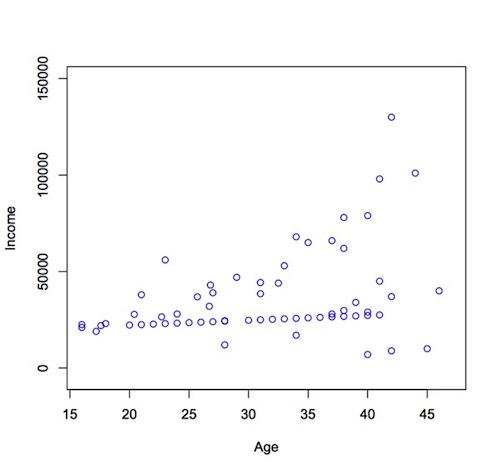
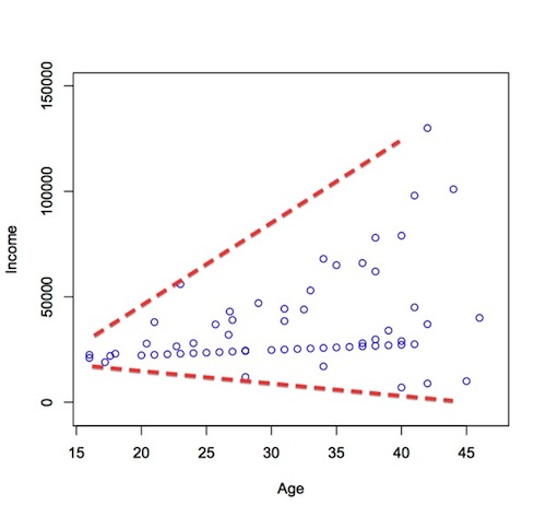
    Heteroscedasticity is a hard word to pronounce, but it doesn't need to be a difficult concept to understand. Put simply, heteroscedasticity (also spelled heteroskedasticity) refers to the circumstance in which the variability of a variable is unequal across the range of values of a second variable that predicts it.

    A scatterplot of these variables will often create a cone-like shape, as the scatter (or variability) of the dependent variable (DV) widens or narrows as the value of the independent variable (IV) increases. The inverse of heteroscedasticity is homoscedasticity, which indicates that a DVÆs variability is equal across values of an IV. Plot No. 1 demonstrating heteroscedasticity (heteroskedasticity)Plot No. 2 demonstrating heteroscedasticity (heteroskedasticity)

    Click to read more ...

    Tuesday
    Dec182012

    How to Create APA Style Graphs and Then Teach SPSS to Do it Automatically!

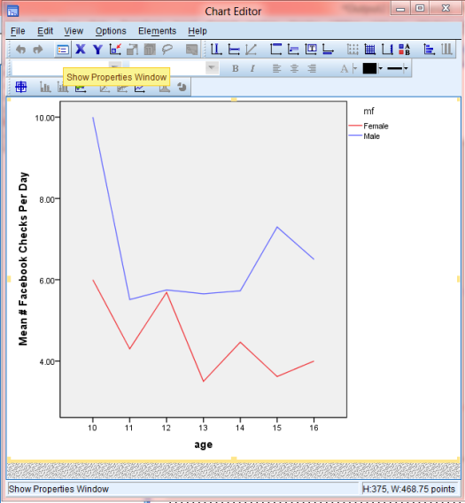
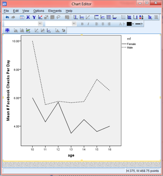
    In the strictest sense, APA style discourages the use of color in graphics, stipulating that it be used only when it is "absolutely necessary". Consequently, most universities and dissertation committees also discourage (or downright forbid) the use of color graphics in dissertation manuscripts. Personally, i find this irritating, as I think most graphical representations of data can be made more clear with the appropriate use of color. However, I suppose the guideline is meant to provide uniformity and consistency across manuscripts, which is understandable.

    Unfortunately, if you use SPSS you've probably already discovered that it produces graphics in color by default. Not to worry, your graphs can be changed easily. Better yet, you can make simple adjustments to your SPSS settings that will force the program to create APA-compliant (i.e. black & white) graphics in all output! Here is how you do it:

    Color Graph- Non-APAAPA-Graph

    Click to read more ...

    Monday
    Dec032012

    Wonderful "How-To" Resources for Learning Structural Equation Modeling (SEM) with AMOS

    AMOS Structural Equation Model GraphicStructural equation modeling (SEM) is a complex beast, and can be quite intimidating to someone trying to learn
    the basics. Fortunately, there are some great resources out there for learning! Unfortunately, I think a lot of beginners don't know what those great resources are, or where to find them.

    One example of a wonderful, but I fear under-used, resource are the SEM tutorial videos created by the AMOS Development Team. The AMOS Development Team tutorial video page features 17 different videos, covering a variety of topics, including (but not limited to): estimating indirect effects, fitting growth curve models, fitting models with categorical and ordinal variables, working with censored data, Bayesian estimation, and mixture modeling/latent class analysis.

    If learning the mechanics of running an SEM model seems like putting the "cart before the horse" to you, because you are still trying to grasp SEM on a conceptual level, check out Principles and Practice of Structural Equation Modeling by Rex B. Kline, PhD. Dr. Kline's book is well written and easy to understand (relative to the topic).

    Page for SEM tutorial videos created by the AMOS Development Team:
    http://www.amosdevelopment.com/video/index.htm

    Guilford Publishing's Principles and Practice of Structural Equation Modeling page:
    http://www.guilford.com/pr/kline.htm

    Amazon's Principles and Practice of Structural Equation Modeling page:
    http://www.amazon.com/Principles-Practice-Structural-Equation-Methodology/dp/1606238760

    Editorial Note: Stats Make Me Cry is owned and operated by Jeremy J. Taylor. The site offers many free statistical resources (e.g. a blog, SPSS video tutorials, R video tutorials, and a discussion forum), as well as fee-based statistical consulting and dissertation consulting services to individuals from a variety of disciplines all over the world.

    Click to read more ...

    Monday
    Oct292012

    Interpreting the Intercept in a Regression Model (repost)

    The following is not a Stats Make Me Cry original, but rather something I came across and found very interesting. If you are interested in the topic, please read the preview and follow the link that follows to the original site.


    The intercept (often labeled the constant) is the expected mean value of Y when all X=0.

    Start with a regression equation with one predictor, X.

    If X sometimes = 0, the intercept is simply the expected mean value of Y at that value.

    If X never = 0, then the intercept has no intrinsic meaning. In scientific research, the purpose of a regression model is to understand the relationship between predictors and the response. If so, and if X never = 0, there is no interest in the intercept. It doesn’t tell you anything about the relationship between X and Y.

    You do need it to calculate predicted values, though. In market research, there is usually more interest in prediction, so the intercept is more important here...

    Read the rest of Karen's article here...

    Click to read more ...

    Monday
    Jun252012

    Why You Shouldn't Conclude "No Effect" from Statistically Insignificant Slopes (repost)

    The following is not a Stats Make Me Cry original, but rather something I came across and found very interesting. If you are interested in the topic, please read the preview and follow the link that follows to the original site.


    It is quite common in political science for researchers to run statistical models, find that a coefficient for a variable is not statistically significant, and then claim that the variable "has no effect." This is equivalent to proposing a research hypothesis, failing to reject the null, and then claiming that the null hypothesis is true (or discussing results as though the null hypothesis is true). This is a terrible idea. Even if you believe the null, you shouldn't use p > 0.05 as evidence for your claim. In this post, I illustrate why.

    To demonstrate why analysts should not conclude "no effect" from insignificant coefficients, I return to a debate waged over blogs and Twitter about a NYT article. See Seth Masket's original take, my response, and Seth's recasting. The data come from Nate Silver's post, which adopts a more nuanced position that I think is appropriate in light of the data.

    Read the rest of Carlisle's article here...

    Click to read more ...

    Saturday
    Jun232012

    To syndicate or not to syndicate, that is the question...

    As some of you probably noticed, life doesn't always allow me to blog as often as I'd like. However, I don't want that to stop the flow and dissemination of info to my readers, especially when I'm constantly stumbling across great content in the "blogosphere", on a variety of stats topics!

    With this in mind, I'm thinking of adopting the practice of occasionally posting (in a limited way) a syndicated article that I think is especially interesting. To be clear, I intend to spread good content not steal someone's effort. To make this clear, my plan is to only post the title and a paragraph or two of the article, which will be followed by a link to the full article on the original blogger's site.

    What do you think? Do you think a curated stream of stats content that I particularly find interesting, sprinkled in among my normal blog posts would be a good idea?

    Editorial Note: Stats Make Me Cry is owned and operated by Jeremy J. Taylor. The site offers many free statistical resources (e.g. a blog, SPSS video tutorials, R video tutorials, and a discussion forum), as well as fee-based statistical consulting and dissertation consulting services to individuals from a variety of disciplines all over the world.

    Click to read more ...

    Monday
    Apr232012

    Please Vote on the "Top Confusing Stats Terms"

    Please tell me what stats terms you think are the most confusing! Please order the terms you choose, according to how confusing they are (with #1 being most confusing). The results will dictate what topics are covered in future blogs!

    Blog entries for Confusing Stats Terms #10, #9, and #8 are already posted, so I'm only asking for terms #7 through #1. Thanks for your input!

    http://www.statsmakemecry.com/confusing-stats-terms/

    Click to read more ...

    Friday
    Apr202012

    How to Conduct a Repeated Measures MANCOVA in SPSS

    In today's blog entry, I will walk through the basics of conducting a repeated-measures MANCOVA in SPSS. I will focus on the most basic steps of conducting this analysis (I will not address some complex side issues, such as assumptions, power…etc). If you find yourself with lingering questions after walking through this blog, feel free to leave questions in the "comments" section, or visit the MANCOVA section of my discussion forum to find answers and/or ask questions of your own. Full disclosure: the example data used is from the SPSS sample/help files, and it can be downloaded below.

    Let's get started:

    Repeated-Measures MANCOVA is used to examine how a dependent variable (DV) varies over time, using multiple measurements of that variable, with each measurement separated by a given period of time. In addition to determining whether the DV itself varies, a MANCOVA can also determine wether other variables are predictive of variability in the DV over time. If that wasn't crystal clear, don't worry, just keep reading.

    Repeated-Measures MANCOVA Example:

    In our example, your local stats store Stats "R" Us launched a marketing campaign, with three different strategies (variable name: promo; value labels: Strategy A, Strategy B, Strategy C). Stats "R" Us launched campaigns in markets of three different sizes (variable name: mktsize; value labels: Small, Medium, and Large), and measured the sales in each store every three months over the course of one year (4 time points; variable names: sales.1, sales.2, sales.3, and sales.4; see data below).
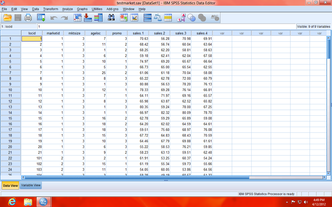
    SPSS MANCOVA example Data image

    NOTE: Sales are scaled in "thousands" (e.g. 70.63 is actually $70,630). Also, your data should be in person-level (a.k.a. "wide") format (as opposed to person-period, a.k.a. "long", format), meaning each row of data is a single case (store, in our example). If it were in person-period (long) format, each case (store) would have the number of rows equal to the number of repeated measures (four, in our example), because the repeated measures (sales.1, sales.2, sales.3, and sales.4) would be stacked to form a single variable (Sales).

    Click to read more ...

    Tuesday
    Sep062011

    The Worst Mistake Made on a Dissertation Is...

    I have a saying that I like to tell consulting clients, which is easier said than done, but I think are words for doctoral candidates to live by: "The only bad dissertation draft is one that isn't turned-in." The most common factor that unnecessarily slows progress on a dissertation proposal or defense is a propensity to strive for the perfect draft. As a graduate student, we all fantasized of turning-in our first draft and having our advisor, being so amazed at its brilliance, insist that you accept your PhD on the spot.

    Click to read more ...

    Wednesday
    Jul132011

    Moderating Effects with Seemingly Uncorrelated Variables

    I received a great question this week, as a submission to my Ask the Stats Make Me Cry Guy page, which asked: In order for a moderating relationship to exist, do the predictor IV and dependent variable need to be significantly correlated?". This is a question that I am asked a lot, partly because of the common confusion between mediators and moderators and the commonly held belief that an IV and DV should be related for mediation to be present (see my video blog on Mediators, Moderators, and Supressors for more info on this topic). However, moderators are a completely different story. In fact, a simple correlation between two variables can be very misleading, if one relies on it as an indicator of potential moderating effects and/or as an indicator that moderating effects should be tested.

    Click to read more ...

    Monday
    Jun202011

    Using Syntax to Assign 'Variable Labels' and 'Value Labels' in SPSS

    Updated on Tuesday, July 9, 2013 at 12:14PM by Registered CommenterJeremy Taylor

    Preparing a dataset for analysis is an arduous process. Besides recoding and cleaning variables, a diligent data analyst also must assign variable labels and value labels, unless they choose to wait until after your output is exported to Microsoft Word. Unfortunately, that option only leaves additional opportunity for error and confusion, not to mention the inefficiency of editing tables in Microsoft Word. Who among us have not been frustrated while wrestling with Microsoft Word?

    When used in conjunction with the customizable SPSS table "Looks" function, formatting your variable labels and value labels can make your SPSS results tables nearly ready for publication, immediately after analysis (CLICK HERE FOR TUTORIAL VIDEO ON TABLE "LOOKS")! Fortunately, SPSS syntax offers a fairly straightforward method for assigning proper labels to both your variable labels and value labels.

    Screen Shot 2011 06 21 at 9 15 29 AM

    Click to read more ...

    Thursday
    Feb032011

    How to make SPSS produce all tables in APA format automatically!

    Updated on Wednesday, June 8, 2011 at 3:43PM by Registered CommenterJeremy Taylor

    Formatting a graph that was exported from SPSS to Microsoft Word can be an absolute pain. Since neither program is known for it's simplicity or "user-friendliness", the interaction between the two can be predictably tedious and frustrating. The process of converting a standard SPSS table to APA format might be bearable, when you are talking about a single table, but can become overwhelming when you have an entire manuscript worth of tables. Fortunately, a few minor alterations to your SPSS settings can make SPSS do most of the heavily lifting for you, making SPSS automatically produce tables that closely resemble APA format and cutting down your formatting time by as much as 90%!

    APA Format Table Example Before and After

    Click to read more ...

    Monday
    Oct252010

    Confusing Stats Terms Explained: Residual

    When I hear the word "residual", the pulp left over after I drink my orange juice pops into my brain, or perhaps the film left on the car after a heavy rain. However, when my regression model spits out an estimate of my model's residual, I'm fairly confident it isn't referring to OJ or automobile gunk...right? Not so fast, that imagery is more similar to it's statistical meaning than you might initially think.

    Click to read more ...

    Wednesday
    Aug182010

    Confusing Stats Terms Explained: Multicollinearity

    Multicollinearity said in "plain English" is redundancy. Unfortunately, it isn't quite that simple, but it's a good place to start. Put simply, multicollinearity is when two or more predictors in a regression are highly related to one another, such that they do not provide unique and/or independent information to the regression.

    Click to read more ...

    Sunday
    Aug012010

    Confusing Stats Terms Explained: Standard Deviation

    Most people find statistics to be complicated, confusing, and just generally frustrating. One of the biggest causes of confusion is the complicated vocabulary that is associated with stats. Frankly, it sometimes seems that stats terms were made to be intentionally complicated. In fact, some concepts seem perfectly understandable when described inplain English, but seem incomprehensible when described in stats lingo.

    Click to read more ...

    Tuesday
    Jul272010

    Top Ten Tips for Data Analysis to Make Your Research Life Easier!

    While there is no "magic bullet" to make stats and data analysis easy to understand and helpful in our research, there are some things that you can do to avoid pitfalls and help things run smoothly. This "top ten" list offers a few of those things that I think you will find helpful! I'll be posting a video of this list later today on my Stats Videos page.

    Click to read more ...

    Saturday
    Jul102010

    Within-Subject and Between-Subject Effects: Wanting Ice Cream Today, Tomorrow, and The Next Day…

    The conceptual difference between within-subject and between-subject effects is something I am asked about quite often. So often in fact, I thought a blog posting was warranted! As a quick disclaimer, I know this is a complex issue and the description of what each type of effect actual is varies greatly based on the kind of analysis one is conducting. However, what follows is an attempt to provide a basic conceptual foundation to understand the differences.

    Click to read more ...

    Sunday
    Jul042010

    Bonferroni Correction In Regression: Fun To Say, Important To Do...

    The Bonferroni correction is only one way to guard against the bias of repeated testing effects, but it is probably the most common method and it is definitely the most fun to say. I've come to consider it as critical to the accuracy of my analyses as selecting the correct type of analysis or entering the data accurately. Unfortunately adjustments for repeated testing of hypotheses, as a whole, remains something that is often overlooked by researchers and the consequences may very well be inaccurate results and misleading inferences. In this independence day blog, I'll discuss why the Bonferroni Correction should be as important as apple pie on the 4th of July.

    Click to read more ...